

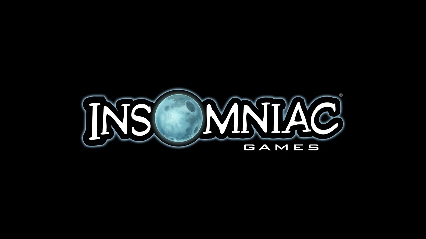
Insomniac Games unveils new logo
Insomniac Games, perhaps best known as the creators of Ratchet & Clank – but also the studio that gave us Resistance: Fall of Man, Sunset Overdrive and currently working on the upcoming Spider-Man game – has unveiled a new logo.
Here’s Insomniac on the new look:
We’ve always tried to evolve with the constantly changing industry we adore. That’s one of the challenges and blessings of remaining completely independent as a studio. But our logo has largely remained the same while we continue to grow. Considering our 25th anniversary in a couple years, and the 15th anniversary of Ratchet & Clank this year, it has become even clearer to us that it’s time to more closely match our visual identity with our studio vision.
As we contemplated a re-brand of our visual identity, we challenged ourselves to “think beyond the moon.” That meant eschewing a simple logo refresh. Instead, we wanted a redesign that reflected our evolution as a studio and as people while retaining some familiarity to our past logo treatments.
[…]
We reviewed this design very early in the exploration process. It caught our attention immediately, and wouldn’t let go even after we explored other directions. It works on multiple levels for us. It’s got a lunar theme, with what appear to be two crescent moons facing each other as the “O” – reminiscent of our past and future. Many folks here also see a portal or lens for the “O”, which we like because it symbolizes exploration as well as how many of our fans see us differently. Some follow us simply because we created their beloved Spyro the Dragon. For others, it’s all about Ratchet & Clank, or Resistance, Sunset Overdrive, our virtual reality games or Song of the Deep. And now we have entirely new fans swinging into our neighborhood to check out the latest on Marvel’s Spider-Man.
Observant fans will see the subtle callbacks to our previous Insomniac Games logo, including the oversized “O,” serif lettering on the “N” and the positioning of “Games” as a core part of our identity
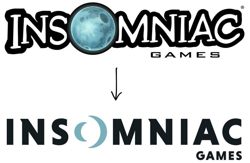
The AAA independent developer hasn’t radically altered its logo since 2002, but as the company explained on its blog, “As we contemplated a re-brand of our visual identity, we challenged ourselves to ‘think beyond the moon.’ That meant eschewing a simple logo refresh. Instead, we wanted a redesign that reflected our evolution as a studio and as people while retaining some familiarity to our past logo treatments.”
More info at – Source